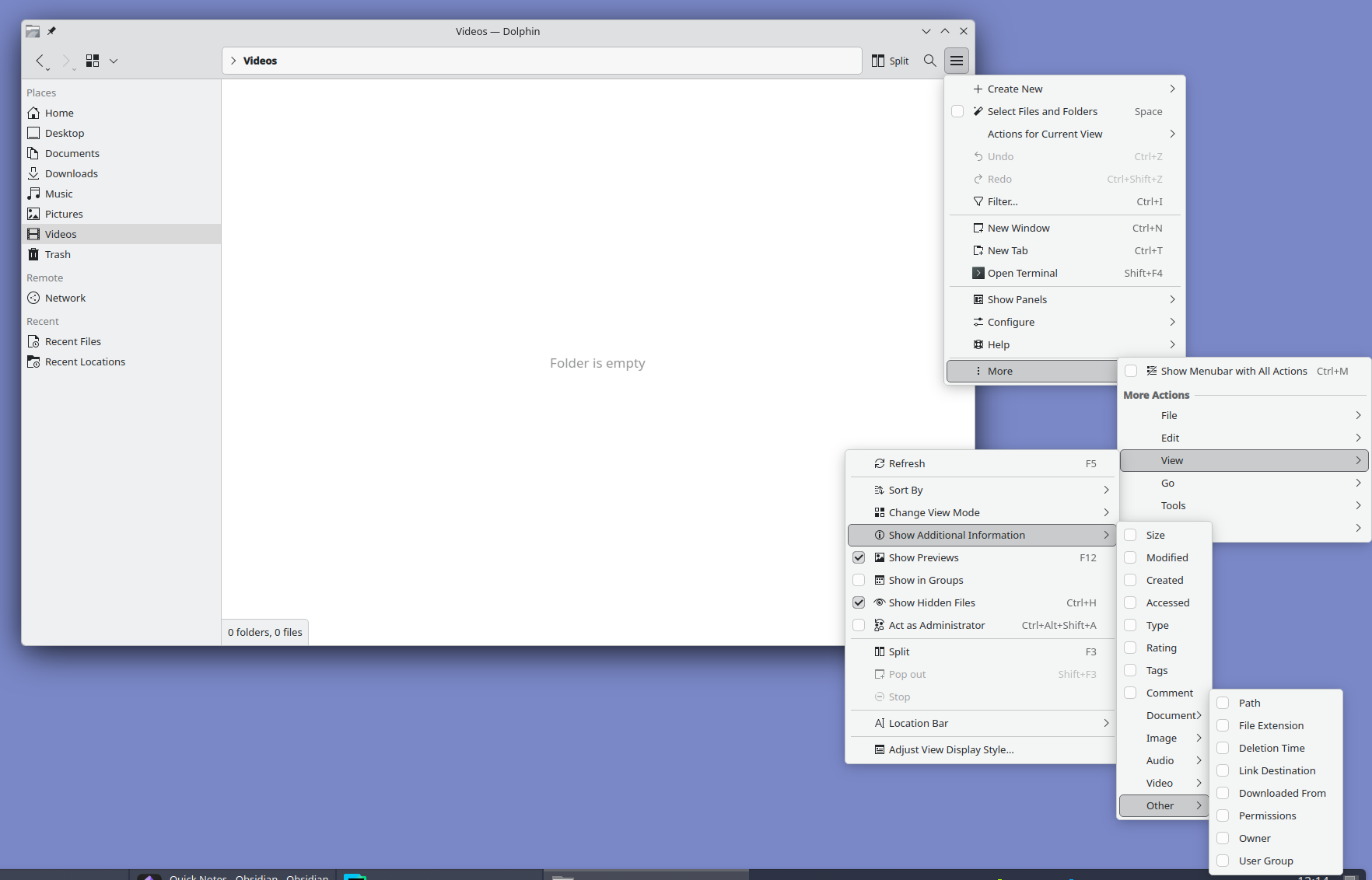
Look at it and tell me this is normal. I love Plasma but oh man do they need to hire a real designer. Someone with balls to unfuck the interface and move all advanced settings out of GUI into a well documented config file.
The sibling comment, meanwhile, is complaining about extra space devoted to explicit controls for all of the extra options. Well, you can't have it both ways. If you want to have a lot of features and options, you have to either devote some space in the main UI to them, or have a lot of deeply nested menus like that.
Or I guess you could do a config file somewhere, but IMO that's even worse. If we're going to complain about bad UIs, isn't it even worse than some deeply nested menus to need to open a separate file somewhere else with a separate program and learn whatever config file syntax they happen to use.
Konsole on left, ghostty (which is gtk) on right. The latter has at least 3 additional lines visible outputting the same command. The giant copy paste buttons, tab bar which wastes a ton of space, are typical of kde apps. The klutter isn’t just visually annoying it makes the apps less useful.
No alignment issues, menus sorted by professional designers, easier to learn UX like ribbon menus and a lot more.
Feel like the design issues stem from it being shaped by existing power users. Familiarity tend to downplay design issues so stability took priority, even though the UX never should've been stabilised in the first place.